What is Share of Search and what are the implications with Search Engine Optimisation?
Intro
A new measurement metric for media performance, called Share of Search, has recently been developed and released by Les Binet. In October 2020, Les announced this new KPI as a leading indicator of marketing performance that correlates so well with Market Share that it can be used as a predictive tool to highlight when your Market Share will decrease.
In short, if your SoS decreases, you can expect your Market Share to decrease in the near future, and vice versa.
I won’t go into the specifics of how Share of Search is supposed to work alongside media metrics, if you want to know more about that, you can watch this Vimeo video of the man himself explaining everything about it.
When Share of Search was announced, I had a number of clients reach out and ask what this metric meant from an SEO reporting perspective. A fair question and, despite the initial purpose of this metric being created, potentially another indicative reporting metric that clients can use to measure competitor activity and correlation with their own marketing and media activity.
So let’s look at a fairly quick way to calculate your Share of Search, against competitors, to see which brand ultimately has the highest Market Share when it comes to branded searches on Google.
In this example we’re going to look at the Funeral Insurance industry in Australia. The reason being there aren’t a lot of Funeral Insurance providers in Australia, so it keeps the data set small to help with the example.
Step 1: Identify The Market’s Main Players
If you are ingrained in a business, you likely know who the market leaders are in that industry. Choosing the top 20 or so brands will help create a broad enough data set that helps you broaden your focus outside of who you probably already focus on as just your top 3 or 4 competitors.
In an industry such as Funeral Insurance, this is relatively small number of companies, and I was able to find a list of all the Funeral Insurance providers in Australia.
For industries with hundreds, or perhaps even thousands, of competitors (think clothing and jewellery for example), getting a comprehensive list isn’t going to be easy, quick or useful. You can use tools such as AHrefs or a keyword rank tracking tool to track the broadest head terms in the niche you want to analyse, and this will end up providing you with a list of brands with the largest Share of Voice for that keyword. Add in your known or most important competitors, and you will have a good enough list to give you an idea of the companies you want to analyse.
Share of Search works for brand terms only. So a caveat to this process is that the data can be skewed by companies who offer more than just one type of product or service that you want to analyse.
In our Funeral Insurance example, there aren’t any companies who solely offer Funeral Insurance. So to analyse just their brand names wouldn’t give you an accurate representation of the Share of Search for that industry.
Similarly with something like Superannuation, you are going to find there are a mix of companies whose only service is Super (AustralianSuper, Hesta, Rest etc.) but you’re also going to find a lot of companies who offer Super as part of their product mix (Commonwealth Bank, AMP, Suncorp etc.).
If you were to compare Hesta’s Share of Search against CommBank’s Share of Search, you’re not comparing a like-for-like number. So you have to do some manual work to narrow down your data set to make it useful.
For the Funeral Insurance category, you’d need to specifically analyse keywords that were [brand] + [funeral insurance] which will give you the best indication of that brand’s Share of Search for that product.
Using the Life Insurance Direct list, that makes our keyword list to analyse look something like this:
- 1300 funeral insurance
- aia funeral insurance
- anz funeral insurance
- apia funeral insurance
- gio funeral insurance
You get the picture. Create a complete list of keywords (whether that’s just branded, or brand + product), and you’re set to move onto Step 2.
Step 2: Data Gathering
We’re primarily looking at Share of Search on Google, therefore the best search data we can use to align with that will be through Google Ads Keyword Planner.
Make sure that, when using Keyword Planner, you set the date range to “All Available” to get the last 4 years’ worth of data.
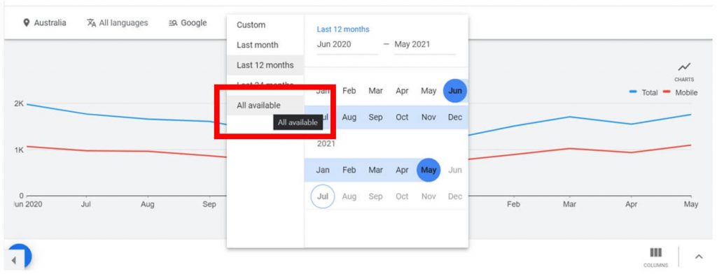
This will come in handy when we’re analysing the Share of Search over time, rather than just considering it a static number.
You can then compile it in your sheet of preference, but saving it in Google Sheets would be useful if you have an API that can pull monthly search volumes into the sheet to update the data automatically.
The output at this stage is a month-by-month view of the search volumes for the brands you’re analysing. Note in the screenshot below there are hidden cells to show the entirity of the data set.
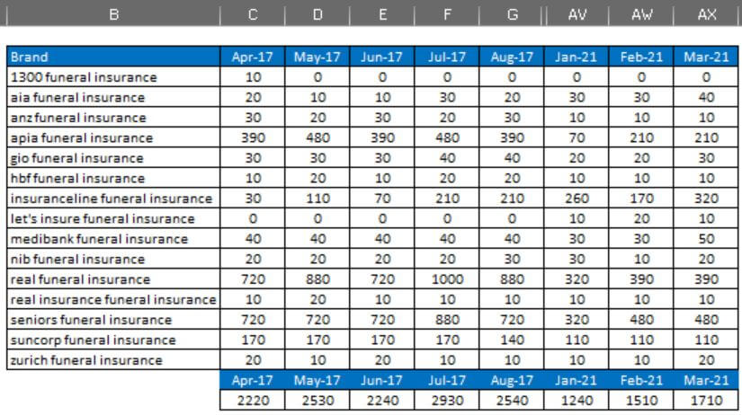
Step 3: Calculating Share of Search
You’ll notice at the bottom of the monthly columns is a totalled number of the monthly search volumes. This gives you the overall Share of Search availability to calculate the individual brand Share of Search.
This can also be useful to track the general trend of the industry you’re analysing.
Is the search interest in brands increasing or decreasing over time, and are there any obvious spikes or seasonal changes that have never been noticed before? Of course you can use Google Trends to do this on a smaller scale, but I prefer to look at the actual search volumes to eliminate Trends’ flaws in calculating interest.
Using the monthly volume for the branded search and the total combined volume for that month, you can calculate the percentage i.e. the Share of Search, for the each brand, for each month.

I like to also create an average Share of Search calculation of all the mothly data points across each brands, which gives you the ability to see who is essentially the market leader in the consumers’ eyes as they are the most likely searched-for brand when searching for a particular product.
Step 4: Visualising Share of Search
You can visualise this in a simple pie chart, to help quickly see who has the largest Share of Search.
It’s also great to take the Share of Search percentages over time and plot the highest-averaging brands onto a line chart. Below are examples of both visualisation outputs.

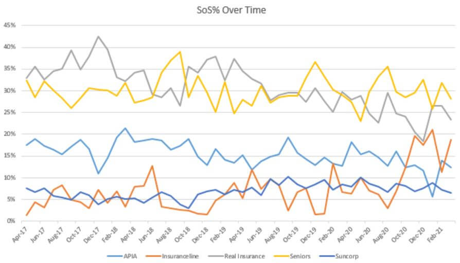
From these types of visualisations you can start to glean the insights that might be interesting to you or your clients. The Share of Search in isolation is very rarely that useful, but it becomes more useful when you interrogate the data alongside other marketing activity that may have occurred.
For example, in the line chart abover, we can see a clear sustained spike in activity for Insuranceline in October 2020 onwards. Could this align with increased marketing or media spend, or something else?
Similarly, Real Insurance has a fairly consistent downwards trend of Share of Search from their peak in 2017. Has their marketing spend focus changed from Funeral Insurance to another of thei products?
It’s also a good idea to cross-reference the actual search volume numbers during periods of high movement with the percentage swings to see if, using the example above, Insuranceline’s total number of searches increased alongside their spike in Share of Search, or if it was overall market search interest change, or if it’s capitalisation on another brand’s decrease in Share of Search.
In isolation, these numbers don’t tell us too much, but when you start digging further into the data and combining it, then you unearth some significant insights that might help in your broader marketing efforts.
Sticking with the Insuranceline example above. If you have access to their marketing and sales information, you could correlate in increase in Above The Line media spend in October with an increase in their Share of Search. You could then look at the leads and sales data to see how this has impacted business performance coming specifically through Paid and Organic search, helping you to measure effectiveness of cross-channel media investment.
Ultimately, this also tells us the average percentage chance of a consumer searching for your brand over anothe when looking for a particular product, which again cna be very helpful to sit alongside other brand health metrics such as Awareness and Consideration brand tracking.
Final Word
And there you have it, my step-by-step guide for calculating your Share of Search, alongside your competitors to help better your understanding of how consumers prefer different brands when searching for a product.
It’s a very simple process to undertake that can help you start to delve deeper into the causes of consumer behaviour, and what you might be able to do in the future to shift Share of Search for your brand.
Starting with 4 years’ worth of data is a really strong starting point for historical tracking. Archiving and updating this on a monthly basis will be a useful tool in your arsenal for marketing and media monitoring.
For SEO, this doesn’t have too much meaning. With Share of Search we are not looking at any aciton post-search. We’re not looking at the click, and whether it goes though Paid Search or Organic Search, it’s purely an analysis of consumer behaviour, preference and intent when it comes to brand searches in a vertical.
It’s meant to raise more questions than answer them. Calculating your Share of Search is the first step into understanding your niche and figuring out what’s working for your business.